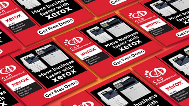
Have you ever thought, “how can I create banner ads that people would want to click on?” Fret no more because you have come to the right place to get all your doubts cleared and all the solutions to your problems.
Why are banner ads important?
Banner designs ads are some of the most creative and profitable means of marketing in today’s world. They are affordable, easily measurable, and can help with the brand in the awareness stage of the sales funnel. Creating effective web banner designs is about making the ads as clickable as possible. These ads can be easily monitored and measured.
How does it work?
These web banner ads are embedded on the tops of the web pages where they advertise a brand or product with a link to the advertiser’s website. Clicking on the ad will take the user to the page the advertiser has hyperlinked.
Here are some effective methods to have your web banner ad stand out and use it effectively to improve CTR.
Use appropriate imagery only when necessary
While images can add value to the ad, it is not always necessary to add imagery to every banner advertisement. If you have decided to use images, use those that add value to your ad and are relevant. And even if you are not using any images, it is okay. Excellent copywriting can also do the job.
When used correctly, graphics and photos help enhance the ad message. IF you can’t afford professional photography, you can always use stock photos.
Use animation
Animation is an effective tool you can use for your web banner. The short duration can hold your target audience’s attention since it lasts for no more than 15 seconds and is shown more than 3 times in a loop.
While using animation, ensure that the video does not distract your audience from the main ad message, and you can also consider using the CTA in the last frame of the animation.
Make your text instantly readable
This goes without saying that, but your text’s typography needs to be killer. To get your target audience to look at the text immediately, you must keep the content short and sweet and the visuals simple. Make your headlines and body copy in different sizes, with all of the four lines or less in total.
Regarding the font, avoid using cursive or hard-to-read fonts. This includes thing font, all in upper case and/or font sizes 10 points or below.
Place and highlight your buttons and CTAs
The Call-to-Action (CTA) button needs to be your ad’s focal point. They are the ones that will raise the CTR of your ad. If you have a series of advertisements as part of a bigger campaign, ensure that your CTA remains the same and preferably with the same design. It needs to be consistent throughout.
The CTAs need to be simple. For example, some good and effective CTAs are “Learn more”, “Get Started”, “Shop Now”, or “Discover More”.
We use data and creativity to help you build a brand identity that sets you apart from the rest. If you like our ideas above, take a look at our works on thebumblebee.in.


